How to Design a Cross Stitch Pattern of Your Own
Designing a chart is three decisions taken in order: what the subject is, how many stitches across the grid is, and how many colours it may use. Size decides almost everything downstream. The same photo at 100 stitches across is 14.3 hours of work; at 200 across it is 57.4. Most abandoned patterns were sized wrong, not drawn wrong.
Three decisions, in this order
Subject, size, palette. People usually do them in the reverse order, starting with a colour count because that is the control the software puts in front of them, and the size ends up as whatever the preview looked good at.
That is backwards. Size is the decision that spends your year.
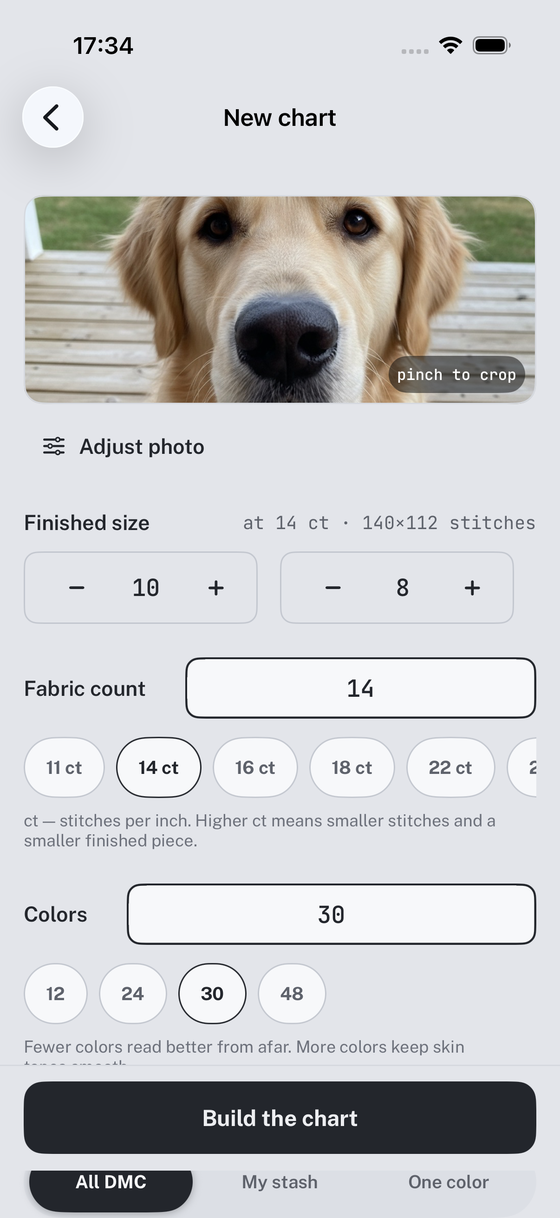
The size decision, with the numbers on it
Below is one photograph of a dog put through the same conversion seven times. Twelve colours every time, 14 count aida, two strands. The only thing that changes between rows is how many stitches across the grid is.
| Grid | Stitches | Finished on 14 ct | Skeins | Hours | Photo px per stitch |
|---|---|---|---|---|---|
| 60 × 48 | 2,880 | 4.3 × 3.4 in | 12 | 5.1 | 17.1 |
| 80 × 64 | 5,120 | 5.7 × 4.6 in | 12 | 9.0 | 12.8 |
| 100 × 80 | 8,000 | 7.1 × 5.7 in | 13 | 14.3 | 10.2 |
| 120 × 96 | 11,520 | 8.6 × 6.9 in | 17 | 20.7 | 8.5 |
| 140 × 112 | 15,680 | 10.0 × 8.0 in | 19 | 27.7 | 7.3 |
| 180 × 144 | 25,920 | 12.9 × 10.3 in | 27 | 46.3 | 5.7 |
| 200 × 160 | 32,000 | 14.3 × 11.4 in | 32 | 57.4 | 5.1 |
Three things fall out of that table.
The hours are not linear with the inches, they are linear with the area. Going from 100 stitches across to 200 doubles the width and quadruples the work: 14.3 hours becomes 57.4. Nobody thinks in area while dragging a slider, which is why this particular mistake is so common.
The thread bill barely moves at the small end. Twelve skeins at 60 across, twelve at 80, thirteen at 100. That is the one-skein-per-colour minimum doing the work: a small chart uses a tiny fraction of every skein it buys, so the list is set by how many numbers you allowed, not by how much thread you use. The floss arithmetic is worth reading once, because it explains a lot of otherwise baffling shopping lists.
And the last column runs out. More on that next.
Enough photograph for the size you chose
The rule that matters: about seven pixels of photograph for every stitch, measured inside the crop rather than in the original file.
The source picture here is 1024 by 1024. Cropped to the chart’s 5:4 shape it leaves 1024 by 819 pixels of actual picture, so at 140 stitches across there are 7.3 pixels per stitch. Fine. At 180 across there are 5.7, and at 200 there are 5.1, which means the averaging that turns pixels into squares has almost nothing left to average, and the eyes and the whiskers stop being present in the data at all.
This is a real ceiling, not a quality setting. You cannot decide to make a chart sharper than the photograph you fed it. If you want 200 stitches across, go and take another picture closer in.
The palette, which is a smaller decision than people think
Once the size is fixed, the colour limit changes the character of the chart rather than its scale. On the 140 by 112 version of this photo:
- 30 colours: 32 skeins, 28.6 hours, 106 single stitches sitting alone
- 12 colours: 19 skeins, 27.7 hours, 25 single stitches
- 6 colours: 16 skeins, 27.9 hours, 16 single stitches
The hours hardly moved. The shopping list halved. The number of stitches you have to anchor, work once and anchor again dropped by a factor of four. That trade is almost always worth taking, and it is the single easiest way to make a chart pleasant rather than punishing. There is a whole article on why single stitches appear and what to do about them, because it is the defect that ruins more home-made charts than anything else.
The exception is skin. A face needs small steps between tones or it goes blotchy, and that is the one place where twenty numbers earn their skeins.
What actually ruins a chart
Not the software. These, roughly in order of how often they turn up:
- Too big. Covered above, and it is the main one.
- A busy background. A hedge behind a head will eat half your palette describing leaves nobody will look at. Crop it out, blur it, or replace it with bare fabric.
- Portrait mode. The fake blur a phone applies is a smooth synthetic gradient, which is the exact thing that generates stray stitches.
- No dark and no light. A chart needs something near black and something near the fabric or it reads flat. Check that the darkest thing in the photo is genuinely dark before you convert it.
- Colour cast. An orange indoor photo gets stitched orange. The converter matches what is there, not what you remember seeing.
Drawing one from scratch instead
For lettering, borders and samplers, skip the photo entirely. Work on graph paper or in any pixel editor at the exact grid size, one square per stitch, and assign floss numbers at the end. Nothing is accidental in a chart drawn this way, which is its whole advantage.
Two things carry over from the photo case. The bold line every ten squares is not decoration, it is how anyone will count your chart, so put it in. And the legend has to be a table of symbol, floss number and stitch count, because without the counts nobody can tell what they are agreeing to. Both of those are covered in how to read a chart, which is worth reading from the designer’s side as well as the stitcher’s.
The order again, because it is the whole point
Subject, then size, then palette. Decide the size against hours rather than inches: work out how many evenings you actually have, halve it, and pick the row of the table that fits. Everything else is recoverable. A chart you never finish is not.
Every number on this page came out of the model that Flossgrid runs on, from one photograph of one golden retriever, converted seven times with the grid size as the only thing changed.
Questions that come up
What software do people use to design cross stitch patterns?
Broadly three kinds. Desktop pattern software such as PCStitch or WinStitch, which is powerful and expects you to know what you want. Pixel editors like Procreate or Aseprite, where you draw square by square and work out the floss numbers yourself afterwards. And converters, which take a photo and match every square to a thread. The choice matters less than whether the tool tells you the consequences: stitch count, skeins, isolated stitches and hours. Most of them show you a picture and leave the arithmetic to you.
Can you design a pattern without a photo?
Yes, and for lettering, borders, samplers and geometric work it is the better way. Draw on graph paper or in any pixel editor at the exact grid size, one square per stitch, then pick floss numbers at the end. The advantage is that nothing is accidental: there are no stray single stitches because you never placed one. The limit is tone. Drawing smooth shading by hand square by square is slow, which is exactly the job a converter does well.
How big should a first pattern be?
Smaller than you want it to be. Sixty by forty-eight stitches is about five hours and finishes at roughly 4 by 3 inches on 14 count, which is a bookmark or a card. That sounds unambitious until you notice that the same picture at 200 by 160 is 57 hours, and that the difference between the two was one decision made in about four seconds. Finish a small one and the next size up stops being frightening.
Can an AI make a cross stitch pattern?
It can generate a picture, which is not the same thing. A chart has to be stitchable: a real DMC number in every square, a sane count of isolated stitches, a shopping list that exists in skeins. An image model produces none of that, and image models are also fond of soft gradients, which are precisely what turns into confetti on a grid. Generate the picture if you like, then put it through something that counts.
How do I know whether a design will read from across the room?
Shrink it. Look at your chart or your photo at about an inch wide, or squint at it from the far side of the room. What survives is what the finished piece will say from the sofa; everything else is detail you can only see with your nose against the frame. If the subject vanishes at an inch wide, the problem is the composition, and adding colours or squares will not fix it.